Til Death Co.
A wedding brand built entirely on contrast, daring a romance-soaked industry to do a double take.
Til Death Co. is a concept wedding brand built to explore one strategic principle: contrast creates attention.
In an industry saturated with soft palettes, sentimentality, and visual sameness, the goal was to create a brand that disrupted expectation without losing romance.
The foundation was contradiction.
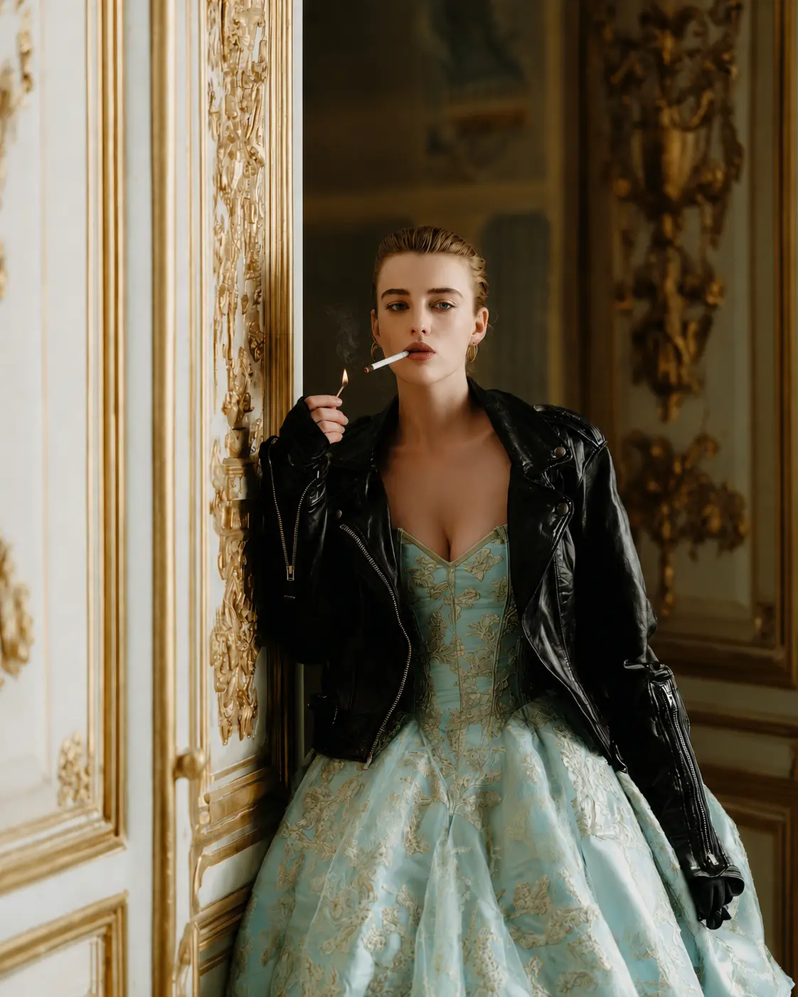
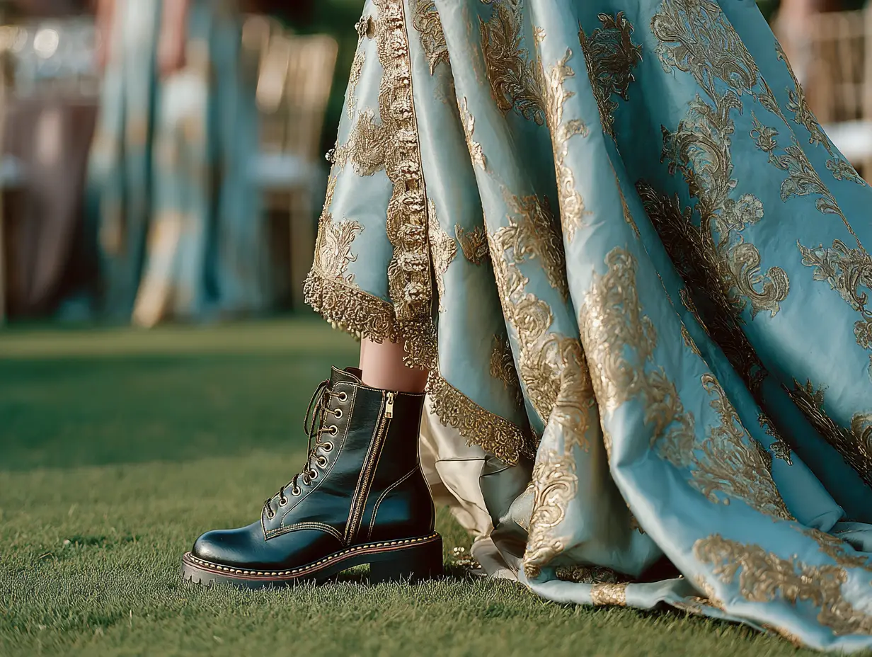
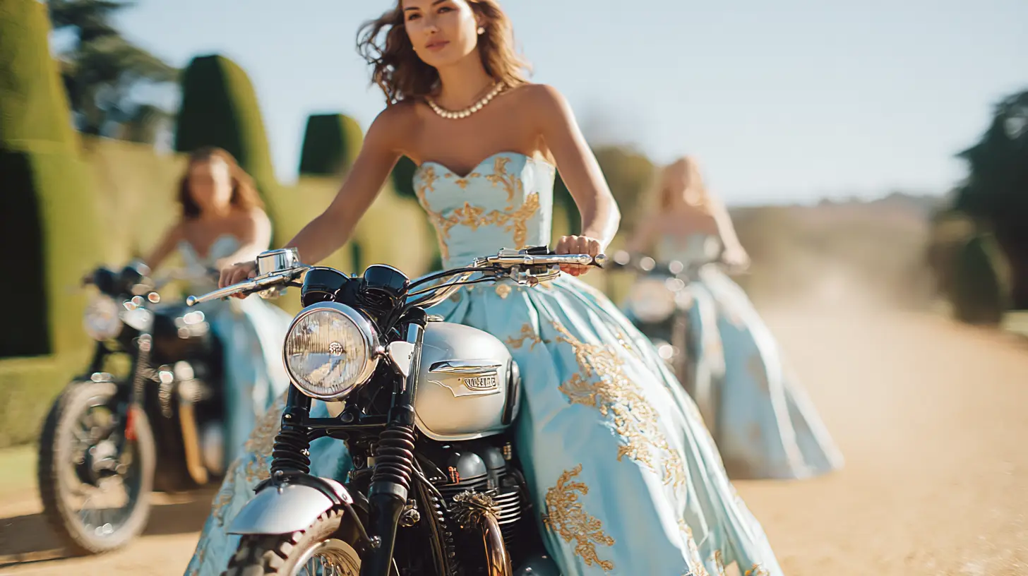
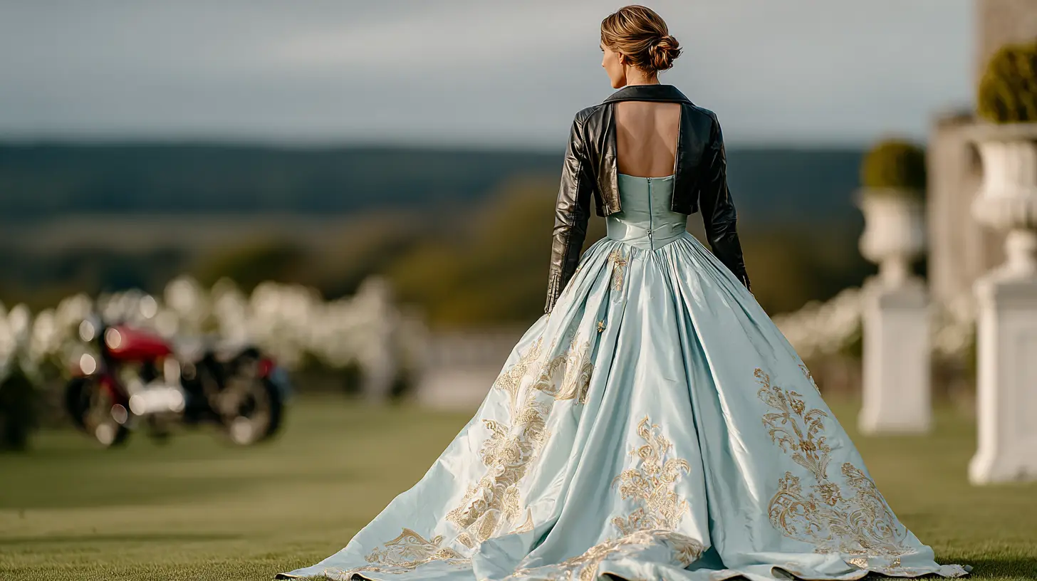
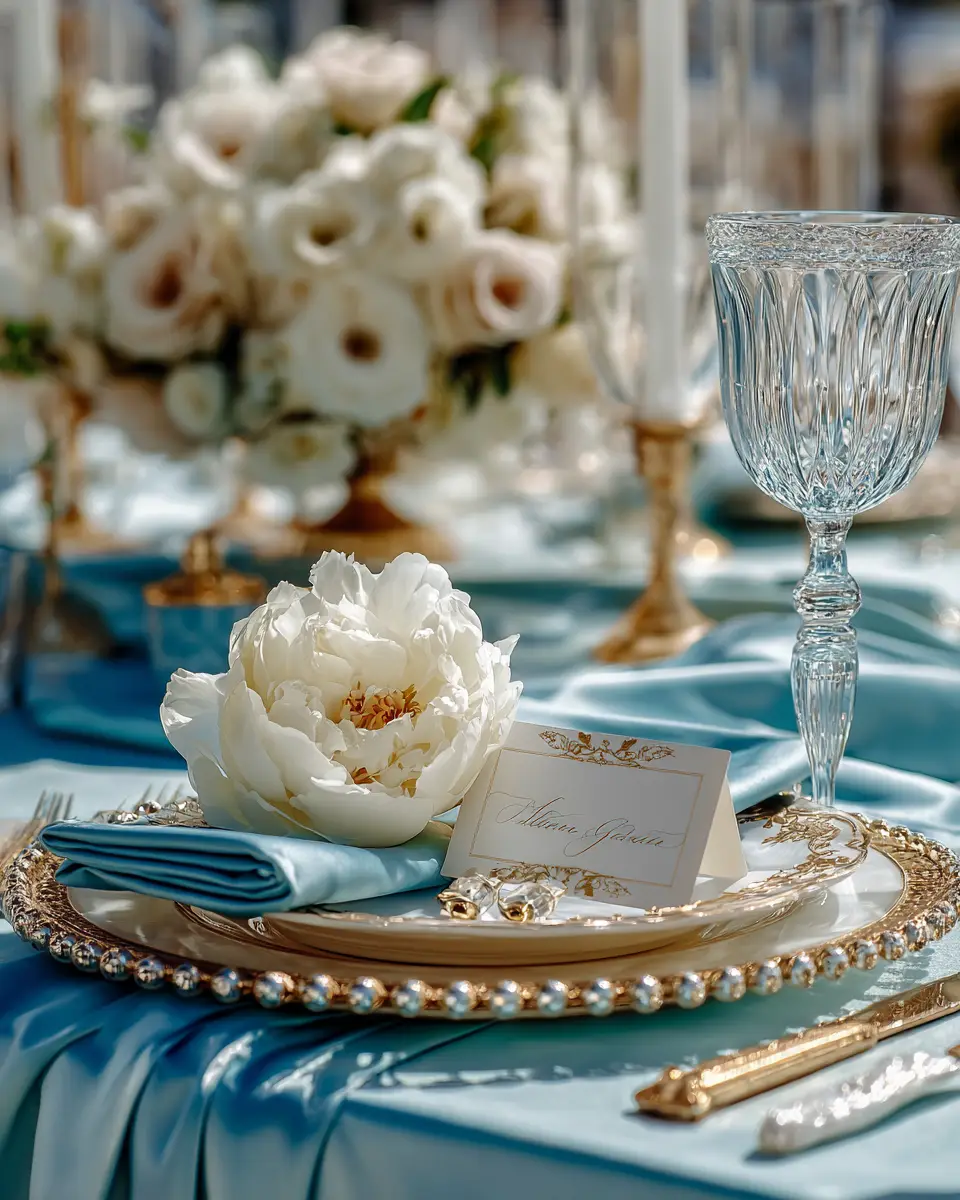
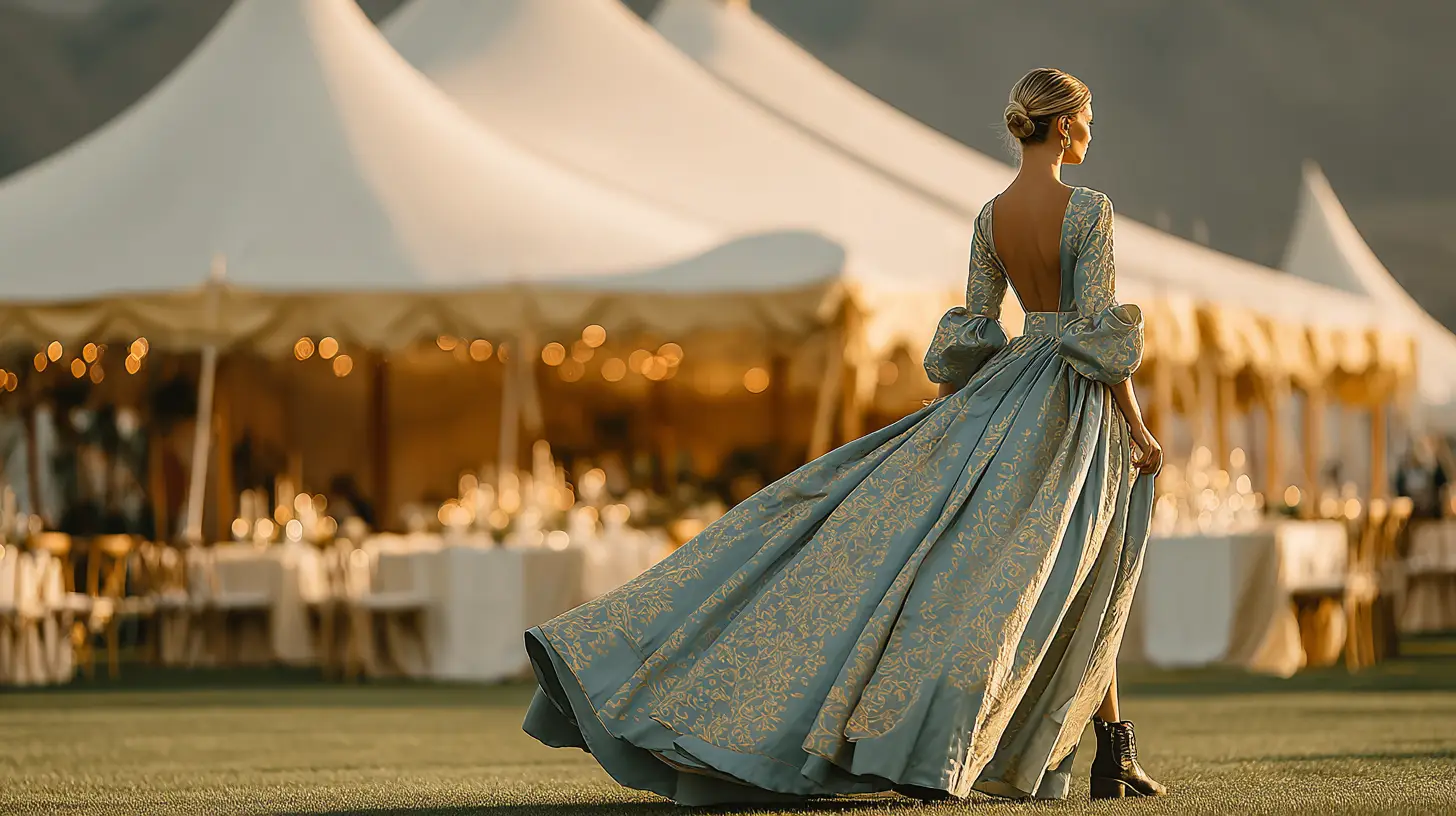
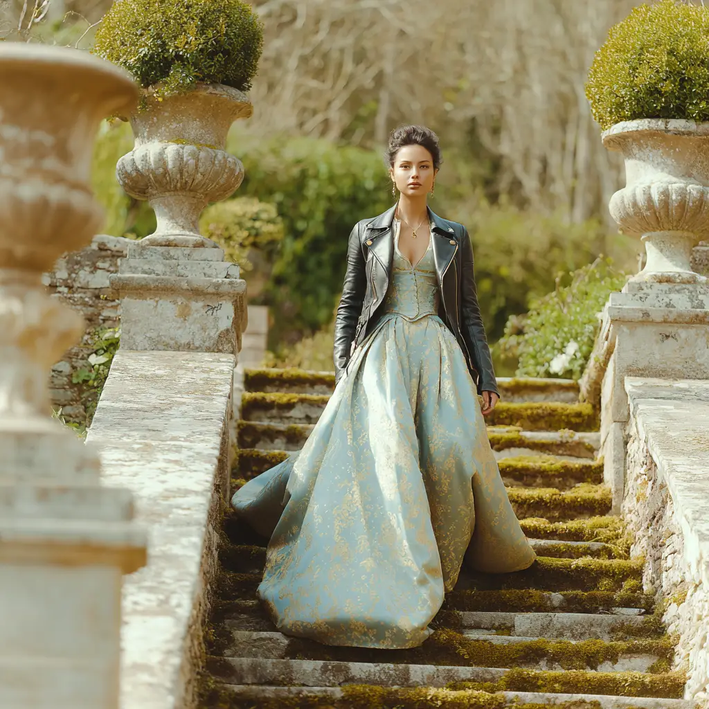
We paired old-world London opulence with rebellious modern styling. Brocade. Candlelight. Velvet. Then leather jackets, motorcycles, combat boots, and sharp attitude. Every element was chosen to create tension between elegance and edge.
That tension is what makes the brand memorable.
The strategy goes deeper than aesthetics.
In a world where AI can generate endless beautiful images, beauty alone has become cheap. What stops attention now is contrast. The unexpected. The element that breaks the pattern and forces a second look.
Til Death was designed as a study in pattern interruption.
Every image asks the same question: why does this work? That moment of friction creates curiosity, and curiosity creates attention.
A brand that makes immediate sense is easy to scroll past. A brand that creates tension earns a second look.
This concept proves what strong branding has always understood: memorability lives in the contrast.