Where it all started
My first clients were novelists, and I promised each of them a website that would feel like opening one of their books.
Make the website feel like the book
I came to web design through fiction. After leaving law school I was writing novels and sitting in writers' groups, and the authors around me needed websites. I taught myself to build them, and that side project became my business.
The promise I made those authors was simple and, at the time, unusual. When your readers land on your site, it should feel the way it feels to open one of your books. Most author sites back then were a photo, a bio and a list of titles. I read the books first, then designed the world they lived in.
Yes, these sites look their age. Fixed widths, tiny type, metallic gradients I would never use now. Look past that and you can see the instincts I still work from.
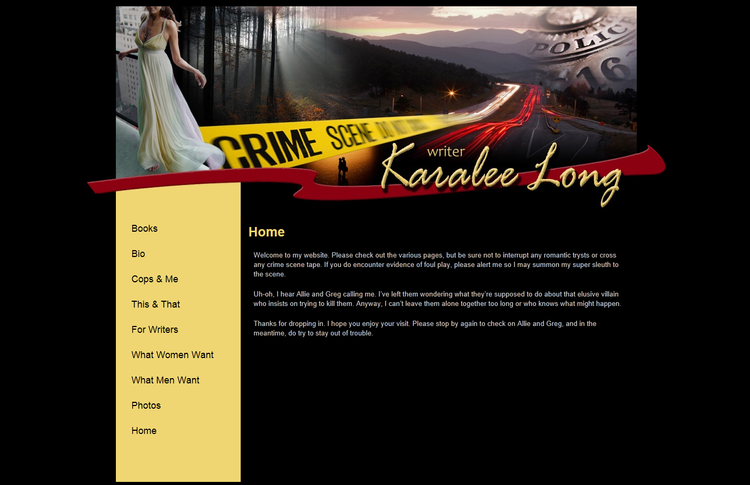
Karalee Long put crime-scene tape through a love story
Karalee wrote romantic suspense, so her header travels from a woman in a white gown on a high ledge, through a misty forest and a highway at dusk, to a police badge. Yellow crime-scene tape cuts straight across it, and her name rides a crimson ribbon. The romance and the danger arrive in the same glance. Her copy played along, asking visitors not to interrupt any romantic trysts or cross any crime-scene tape on their way through.
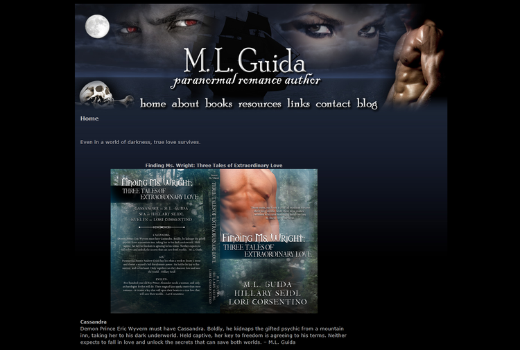
M.L. Guida's menu glows in the dark
Paranormal romance, under a full moon. A black tall ship on a night sea, red eyes watching from the sky, a skull in the corner and a hero who has clearly misplaced his shirt. Even the navigation is lit in the same ghostly type, so the menu belongs to the night with everything else. Her tagline sat right beneath it: “Even in a world of darkness, true love survives.”
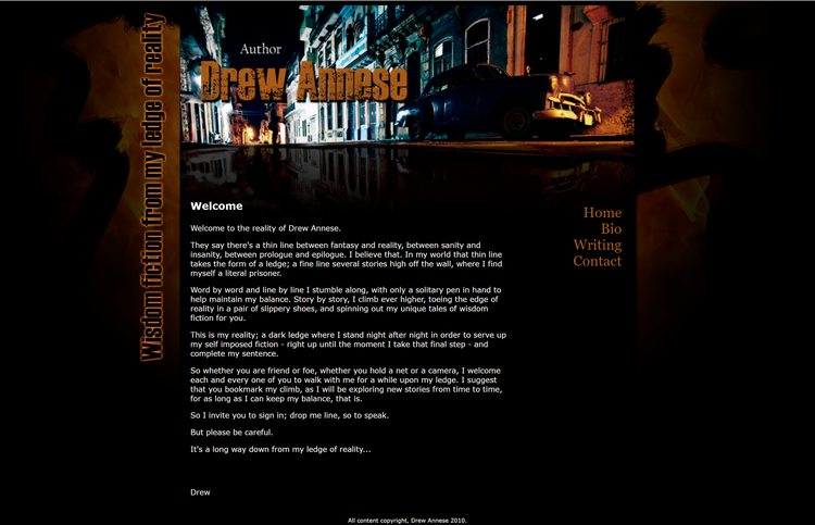
Drew Annese wrote from a ledge between fantasy and reality
Drew described his fiction as coming from his “ledge of reality,” the thin line where the real world tips into something stranger. So his header is an old street at night with a 1950s car parked out front, mirrored and warped in the wet pavement below. The real world sits on top and its slightly wrong reflection runs underneath. His tagline runs down the side of the page in the same weathered orange as his name.
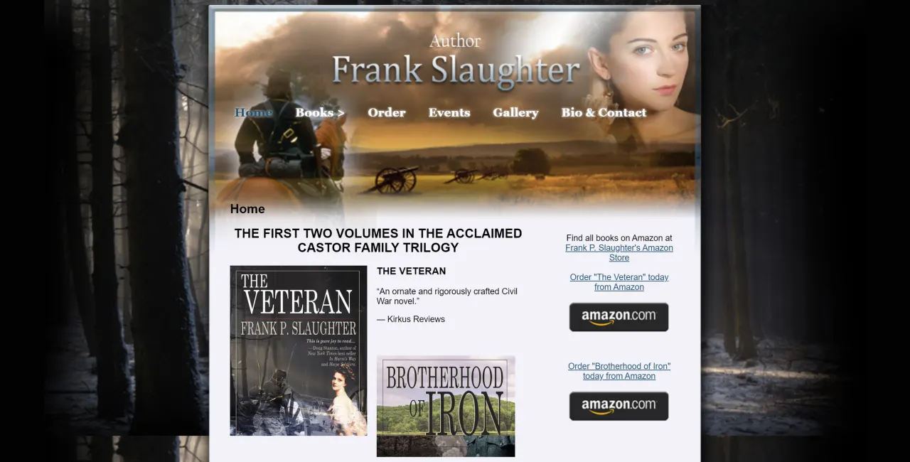
Frank Slaughter's war rides across the sky
Frank's Civil War trilogy needed scale. A cavalry soldier rides away from us across an amber field, cannons stand against the sunset, and a young woman's portrait fades in at the edge, the family waiting at home. The whole scene is framed by a bare winter forest, the navigation floats in the sky, and the books and their Kirkus praise sit directly below.
J. Wachowski's website was her desk
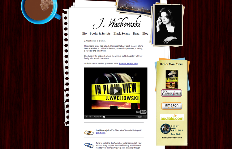
J. wrote screenplays, fiction and erotica. Her own bio lists teacher, children's librarian, television producer, nanny, reporter and actress among her day jobs. No single genre could hold her, so I stopped designing around a genre and designed around the place she writes.
The whole site is her desk, seen from above. Her mocha sits in the corner, because she preferred mocha to coffee. A Chicago skyline is clipped to a stack of photos, because that is where she's from. Her pages are torn loose-leaf, because she was always scribbling down ideas. The navigation is written on the paper, the news is held with paperclips, and the books to buy are on sticky notes. Readers weren't browsing a website. They were pulling up a chair at her desk.
Diane Whiddon did a great job on my website. I'd recommend her without reservations. She's a clear communicator, conscientious, and very intuitive, which helps with all that nebulous touchy-feely, branding, and image stuff that us word-people don't always enjoy. More than once she's gone out of her way to finesse or tweak something that she felt wasn't up to standards, without my even needing to mention it.
Covers that open the story
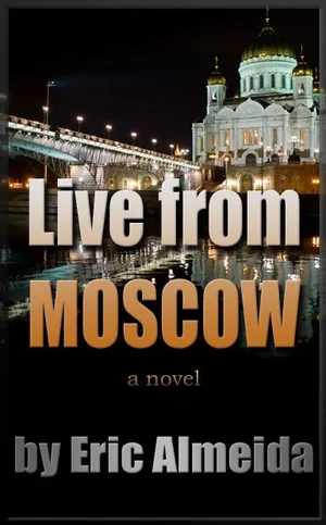
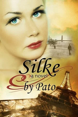
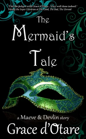
The covers had the same job in a smaller space. Live from Moscow puts a cathedral and a lit bridge on the river at night, with the title in chrome that could only have been made in that era. Silke dissolves a woman's face into a sepia sky, with a wartime bomber on an airfield and the Eiffel Tower in gold light, so romance, war and Paris arrive as one image. The Mermaid's Tale is a glittering Venetian mask reflected on black glass, with teal scrollwork curling in like waves.
Still the same job
Twenty years later the tools are completely different, and my clients run consultancies, practices and speaking careers instead of book series. The job hasn't changed. I still start with the work itself, figure out what it feels like to experience it, and build a website that gives the right person that feeling in the first few seconds.